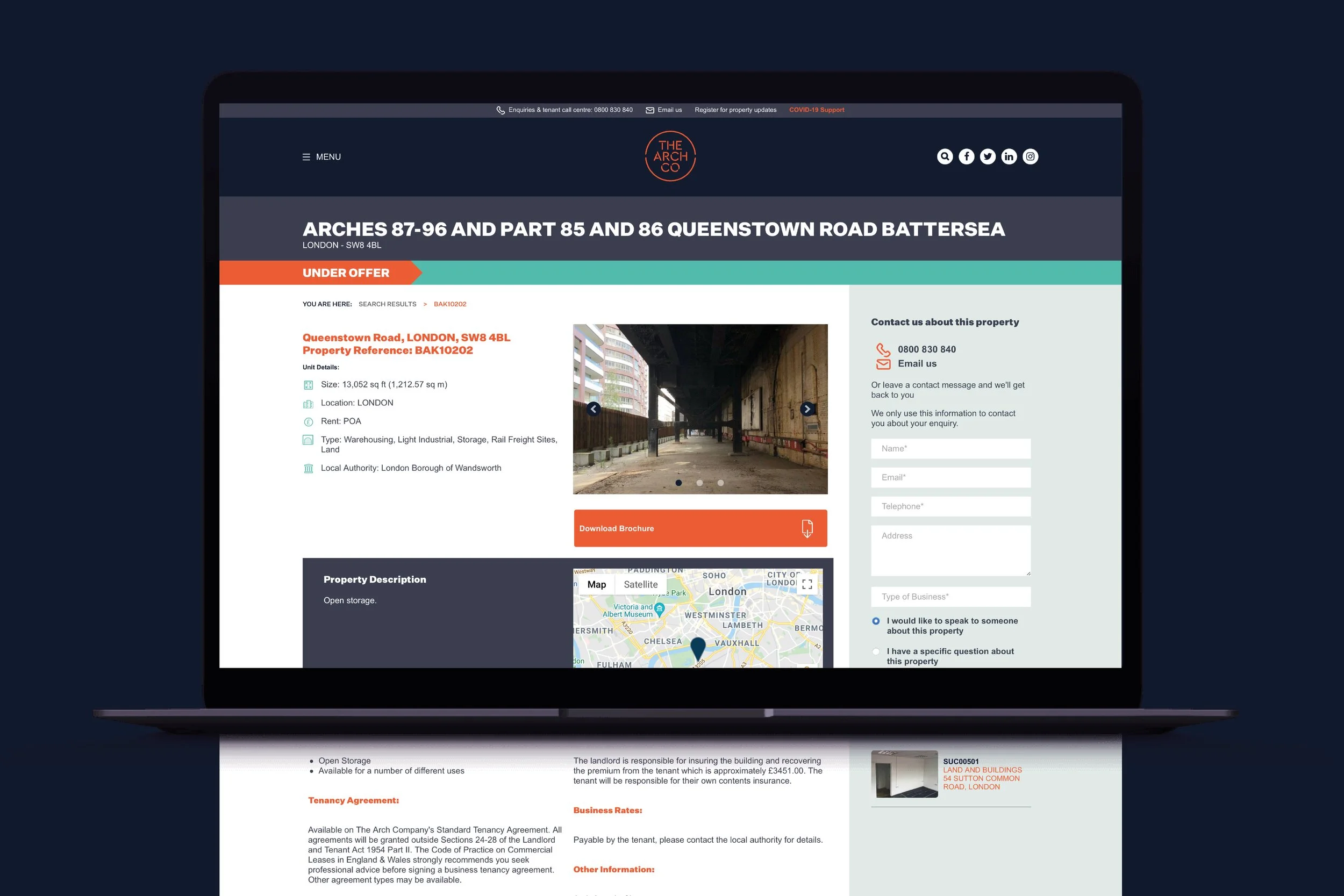
A fresh and memorable brand identity was developed, starting with the name "The Arch Co," which echoes the core of the business—the arches. The identity was crafted to be modern, reflecting the forward-thinking nature of the brand, yet still paying homage to the arches' industrial past.
The logo features a stamp identity designed with a series of curves that echo the architectural form of the arches, paying homage to their historical significance.
The new brand was carefully tailored to attract a broad audience, aiming to include all potential and existing tenants. The design's simplicity and uniqueness cater to a broad demographic, from traditional trades to creative ventures, ensuring everyone feels valued and considered.
The distinctive orange stamp of The Arch Co's branding is a mark of quality and a signpost for dynamic and forward-thinking businesses, inviting locals and visitors alike to discover the diverse offerings within these uniquely purposed spaces.


