Seventy8 Engineering. Modern Precision

Seventy8 Engineering is a well-known engineering company that needed to update its visual identity to reflect its commitment to innovation, precision, and conscientious engineering. The goal was to modernise the brand's image while keeping the trust and industry authority it had built over seven years.

The primary challenge was to change the brand's image from a functional engineering firm to a modern and dynamic leader while maintaining its established reputation. The existing identity was outdated and lacked the depth that today's leading brands have.

To address this, I created a "Modern Precision" theme introducing a sleek, minimalist design with sharp, clean lines. The industrially-inspired colour palette uses Pantone orange 021 for emphasis, set against cool greys and blacks to convey professionalism and forward-thinking innovation.

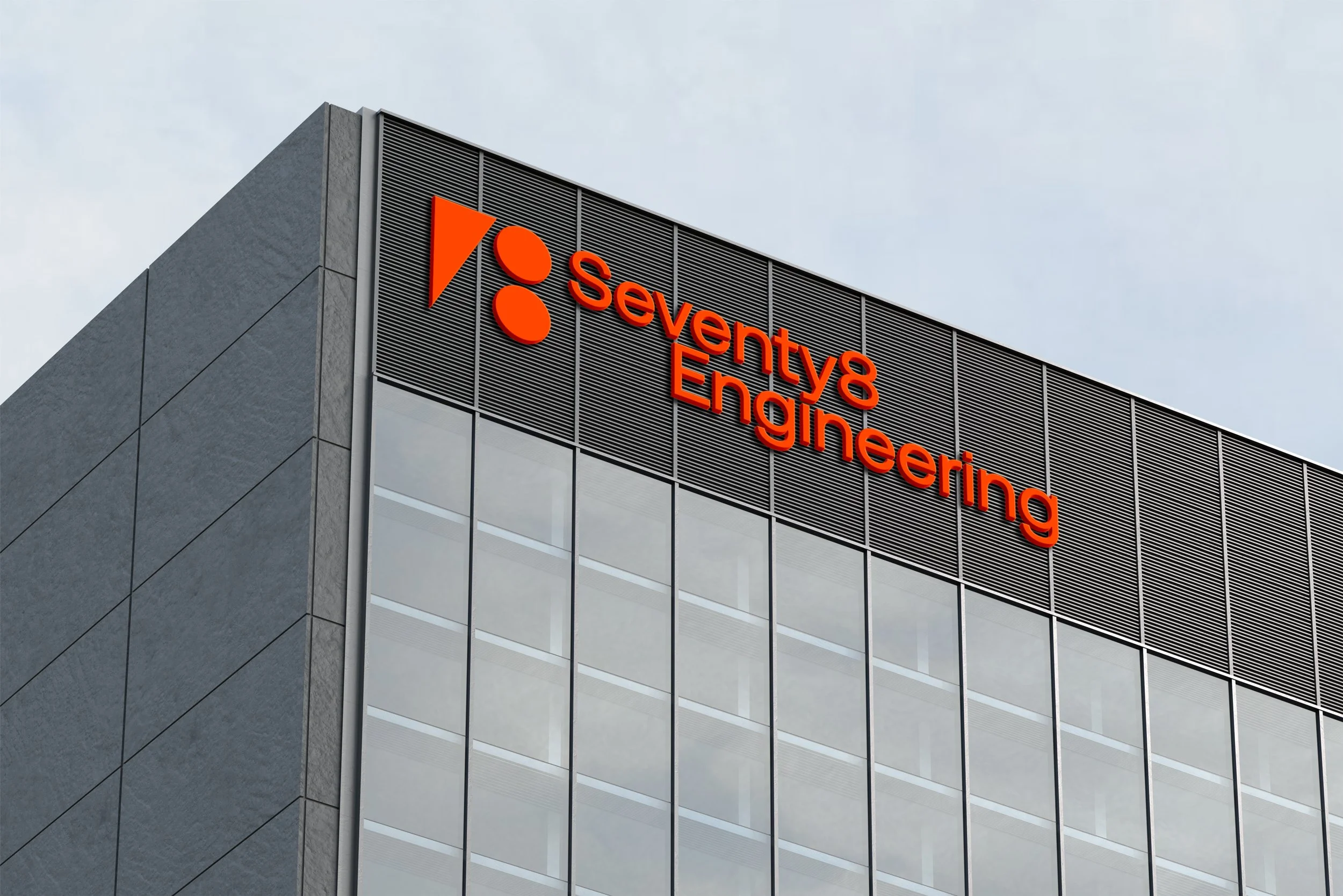
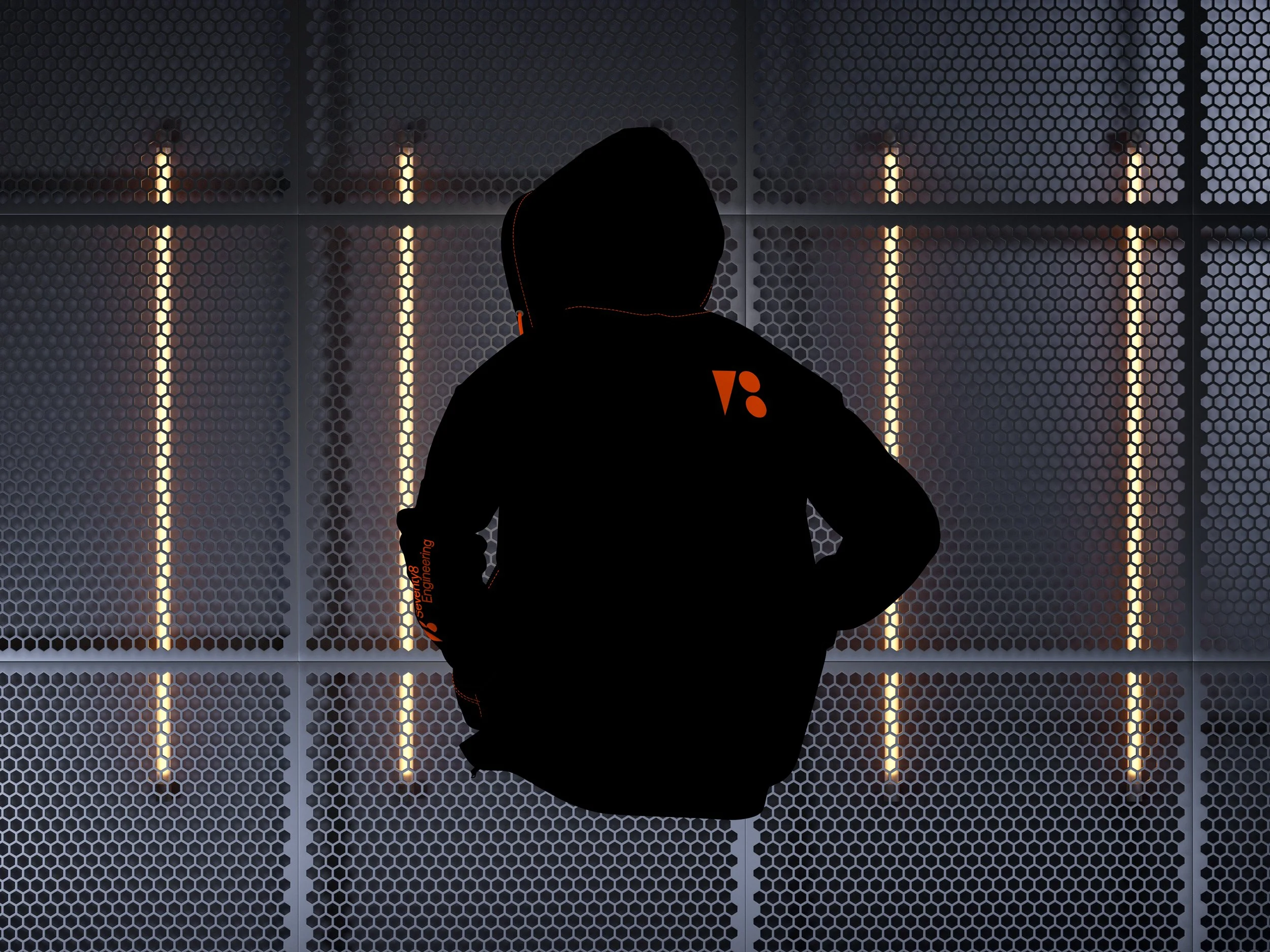
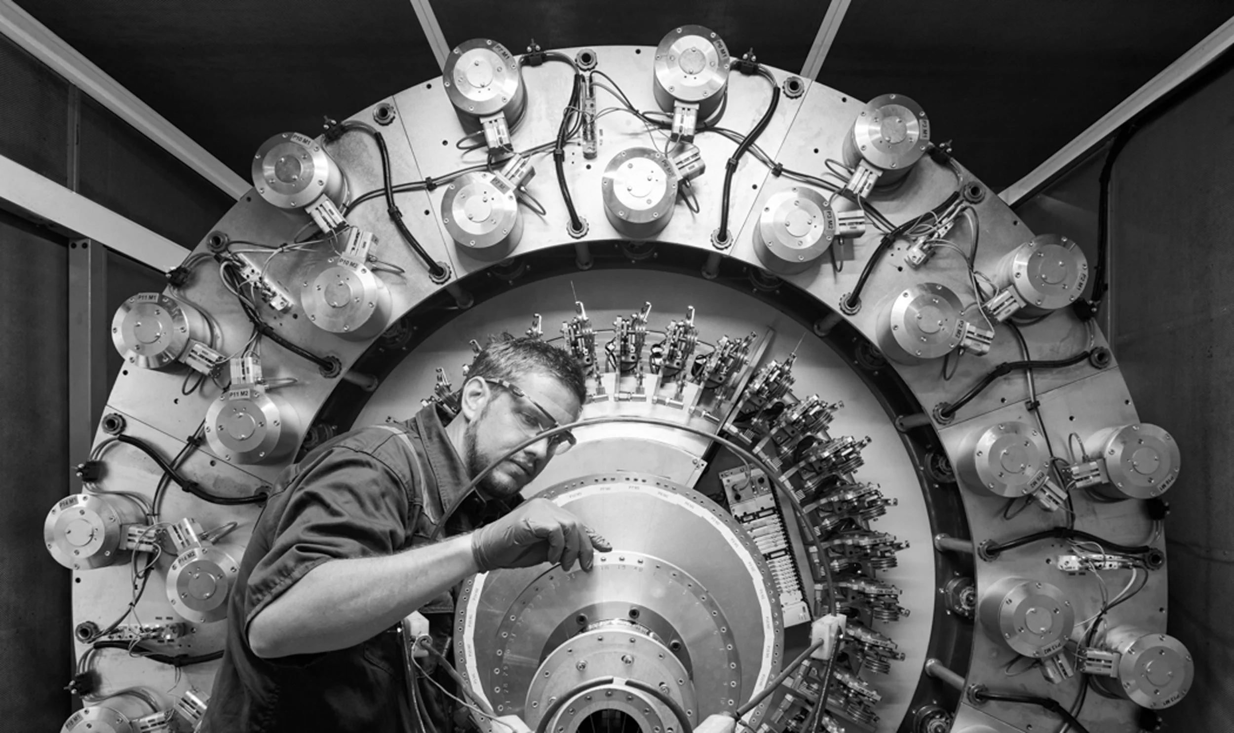
The logo and wordmark were developed to abstract the figures '7' and '8' into geometric shapes, creating a unique and memorable mark that reflected the brand's engineering focus. The brand's photography was carefully curated to highlight the synergy between the people at Seventy8 Engineering and their environment, emphasising the precision and passion behind their work.

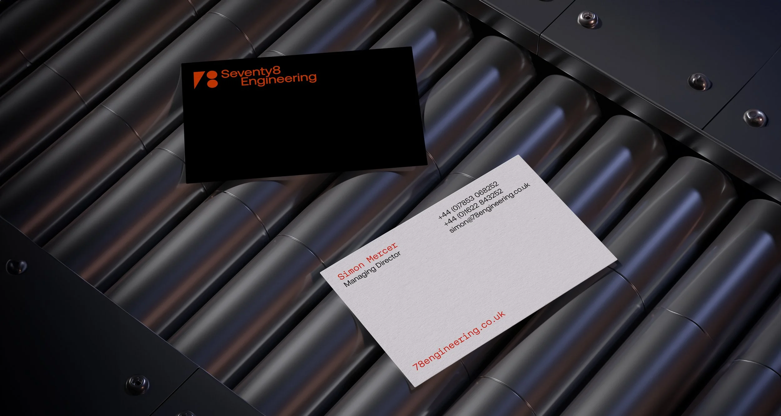
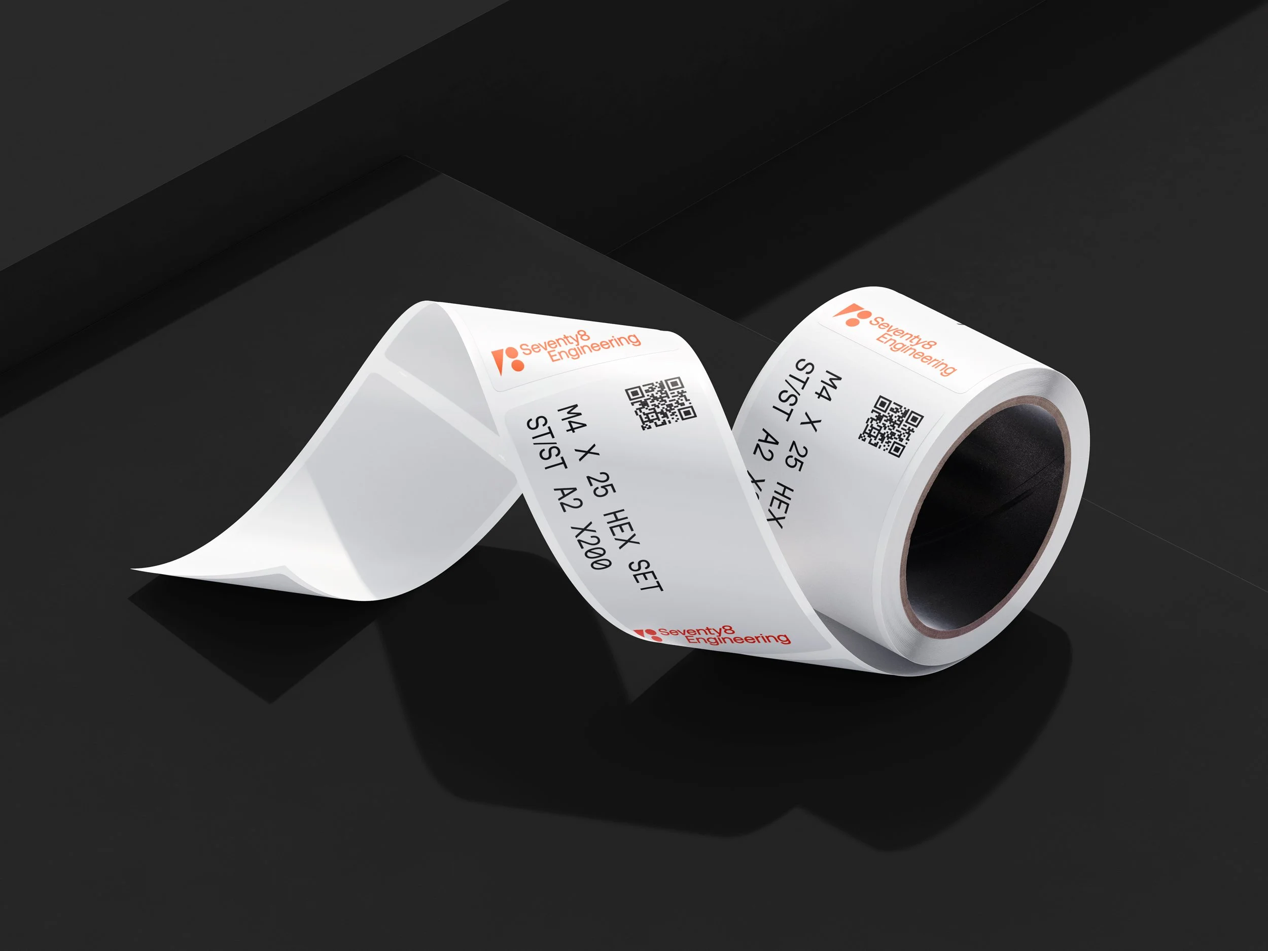
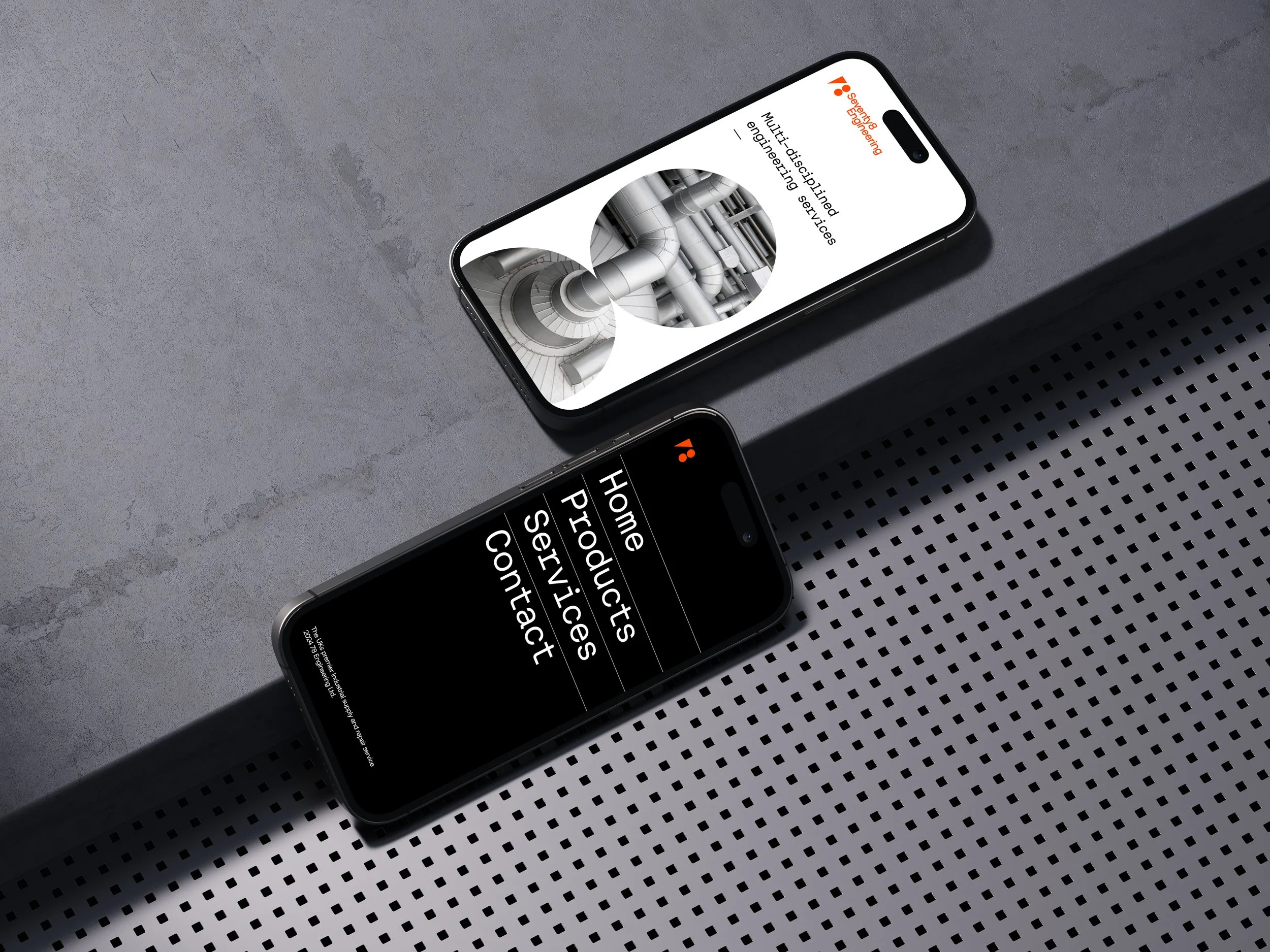
To ensure brand consistency, I designed a complete print, digital, and physical collateral suite, which included business cards, digital templates, and physical signage.

The rebranding of Seventy8 Engineering successfully positioned the company as a contemporary leader in the engineering sector, combining traditional engineering with modern design. This provided a solid foundation for future growth and market presence.

Brand Strategy
Branding
Visual Identity
Art Direction
Publication Design
Copywriting
Livery

Previous
Previous

Monterey Insight. Trusted. Reliable. Unique.

Next
Next

Hero Living. Elevate your everyday.