Insights from Creative Bloq
In a world saturated with visual noise, the power of simplicity cuts through. This was the core of my recent contribution to a Creative Bloq feature on the iconic FedEx logo. Feeling honoured to have my thoughts alongside analyses of what makes it a brand icon. Special thanks to Jon Stapley from Creative Bloq for getting in touch.
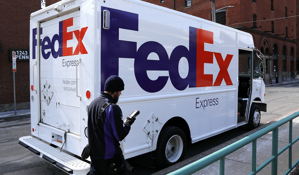
The FedEx logo, known for its clever use of negative space to form an arrow between the 'E' and 'X', is a masterclass in design efficiency. This arrow isn't just a clever design element; it embodies FedEx's values: speed, precision, and delivery. It's a visual cue that tells a story, demonstrating how design can go beyond aesthetics to sum up a brand's mission and values in a single glance.
The logo's true strength lies in its commitment to simplicity. In an information-overloaded world, clear and instant communication is critical. The FedEx logo achieves this by stripping away the unnecessary, leaving behind a design that's both memorable and versatile. It's a testament to the idea that less is more in design.
This principle of simplicity extends beyond logos; it's a core philosophy that guides what I do. Whether branding, graphic design, or digital strategy, the goal remains the same: crafting simple, impactful, and practical solutions. The FedEx logo is a powerful reminder of this, showing how simplicity can transform how a brand is perceived and experienced.
When harnessed effectively, simplicity becomes a communicator – conveying a brand's ethos in ways words never could.
If you need help to refine your brand identity, please feel free to explore my services to find out how I can help.
